Ligature Logos
- Nov 28, 2016
- 1 min read


Ligature Logo Project: Emma Annonio Date: 11/28/16 What is a ligature logo? A ligature logo is blending two or more letters into one. This creates a seamless and tied together look for companies to display as their logos. How would describe the corporate identity of ESMA in 5 words? A would describe the corporate identity of ESMA as edgy, modern, clean, fun, and strong.
Which logo out of the two do you feel is the strongest and why? I feel that my first Ligature logo is my strongest because I believe it demonstrates the use of my techniques better. I also believe that this logo better identifies with the company.
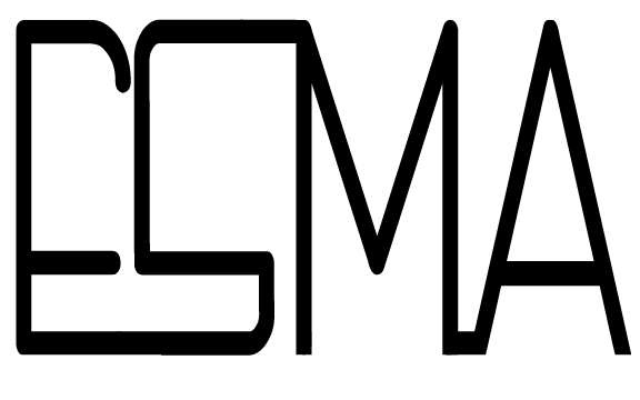
If you had no requirements or restrictions how would your logo look different? If I had no requirements I would have changed the name of the music streaming app to create more possible ways to create logos. I thought that the letters E S M A were difficult to tie together and limited my options in creating a ligature logo. Explain which ligature techniques you have demonstrated on each logo: For the first ligature logo I used the line to connect the letters together. The font I chose for the design already had the A’s extended end and I made that longer, wrapping it under the other letters. For the second ligature logo I demonstrated the technique on shared stroke. The E and the S were connected through the bottom line. The S was connected to the M through the top end of the S. I added a small line connecting the M and the A.


Comments